For most products, color is a detail. For makeup, color is the product. Nobody returns a serum because the bottle was a slightly different amber, but a customer who orders "deep crimson" and gets a bright orange-red sends it back. So makeup is the category where you most need an AI image to be color-accurate, and it is the category where image models quietly fail at exactly that.
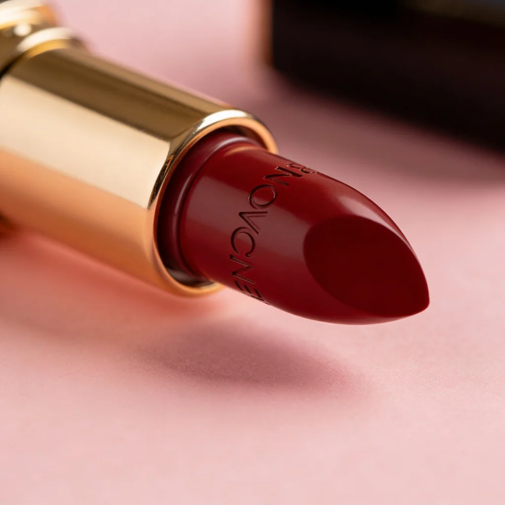
I tested it the simplest way possible. I gave four of the strongest image models the identical prompt, a luxury lipstick bullet in a gold case, "deep crimson-red" shade, on a blush surface, and looked at what color each one actually produced. The gold case and the bullet shape came out well on all four. The shade did not agree on anything. This is the makeup entry in our product-photography series, alongside the skincare, jewelry, supplements, food and beverage, footwear, candles, clothing, furniture, electronics, handbags, sunglasses, glassware, flowers, watches, perfume, packaging, pet products, toys, textiles, cookware, stationery, drinkware, soap, ceramics, art prints, earbuds, houseplants, knives, and automotive wheels tests and the broader best AI image model for product photography roundup.
Quick answer
- The same shade came out four different reds. Bright true-red, berry-crimson, oxblood, and wine. No two matched.
- For the photo: Seedream 4.5 made the most premium shot at the lowest cost; GPT Image 2 the cleanest; Nano Banana 2 the balanced all-rounder; FLUX.2 Pro the editorial one.
- For the shade: none of them. A text prompt cannot hold a brand-accurate color. Use a reference swatch, a hex/Pantone input, or composite your real shade.
If you only remember one thing: pick the model for the scene, and lock the color separately. The word "crimson" is not a color value, and every model proves it.
The test: one shade, four reds
Same prompt, four models. Here is the color each one produced for "deep crimson-red."
Four models, one instruction, four different colors: a bright true-red, a berry-crimson, an oxblood, and a wine-burgundy. Every one is a defensible "deep crimson-red," and that is exactly the problem. If your brand shade is a specific named color, a model will give you its own interpretation, not yours, and it will give a different one to the next model and sometimes the next render.
The comparison
| Model | Shade it produced for "deep crimson-red" | Photo quality | Other notes | Rough cost/image |
|---|---|---|---|---|
| GPT Image 2 | Bright classic true-red | Cleanest studio | Lightest reading | ~26.4 credits |
| Nano Banana 2 | Deep berry-crimson | Good, believable | Balanced middle | ~9.3 credits |
| Seedream 4.5 | Dark oxblood / wine | Best, premium macro | Invented embossed branding | ~4.8 credits |
| FLUX.2 Pro | Wine-burgundy (purple-leaning) | Editorial | Cheapest, clean | ~3.6 credits |
Credit costs are first-hand from this test on Masonry; rates move, so check current pricing.
Why color is the hard case for cosmetics
The gold case rendered well on all four. The bullet shape, the soft studio light, the blush surface, all fine. Cosmetics is not hard because of the packaging. It is hard because of one thing the other product categories do not lean on as heavily: exact color.
A color word is a description, not a value. "Crimson," "warm beige," "rose," "nude" each cover a wide range, and each model has its own center of that range. That is why the same prompt drifts across models, and it is why "make it a little warmer" produces an unpredictable shift rather than a precise one. For tinted products, foundation, lipstick, blush, tinted serums, this is the difference between an image that sells the right product and one that triggers a return when the real shade shows up.
This is the same dynamic that drives a meaningful share of returns in adjacent categories like apparel, where a color mismatch between the photo and the product is one of the most common reasons items come back. The fix is not a better prompt. It is removing the guesswork from the color entirely.
The workflow that actually works for makeup
Use AI for the scene, and lock the shade with something exact.
- Let AI own the scene. Packaging, lighting, lifestyle context, the gold case, the composition, all four models did this well, and this is where AI saves you a studio day.
- Lock the color with a reference, not a word. Feed the model your real swatch as a reference image, use a tool that accepts a hex or Pantone value, or generate the scene and composite your true product color. Anything but trusting a model to interpret a shade name.
- Watch for invented branding. One model embossed brand-like text on the bullet despite a no-text instruction. Keep tests brand-free and check for hallucinated logos or lettering.
- Proof on more than one screen. Color shifts across displays, so confirm the final on a couple before it goes live.
With the Masonry CLI you can run the same scene across models to pick the best shot, while feeding your real product image so the shade stays yours:
masonry image "luxury lipstick in a gold case on blush silk, soft studio light" --image ./real-lipstick.png --model seedream-4-5
The bottom line
For makeup, the model decides the photo, but it should never decide the shade. In this test the same "deep crimson-red" came out as four different reds, which is all you need to know to stop trusting a text prompt with your brand color. Use AI for the scene, where it is genuinely good, and lock the shade with a reference or an exact value. See how the same fidelity-first logic plays out across products in our best AI image model for product photography roundup, or run your own product from one place with the Masonry CLI.

