Premium stationery is sold on its finishes. A journal is paper and board, but what makes someone pay for it is the gold foil stamping that catches the light as you tilt it, and the deboss you can run a thumb across. Those are subtle, physical, light-dependent effects, exactly the kind of thing a flat image has to fake convincingly. So I tested whether AI can fake them.
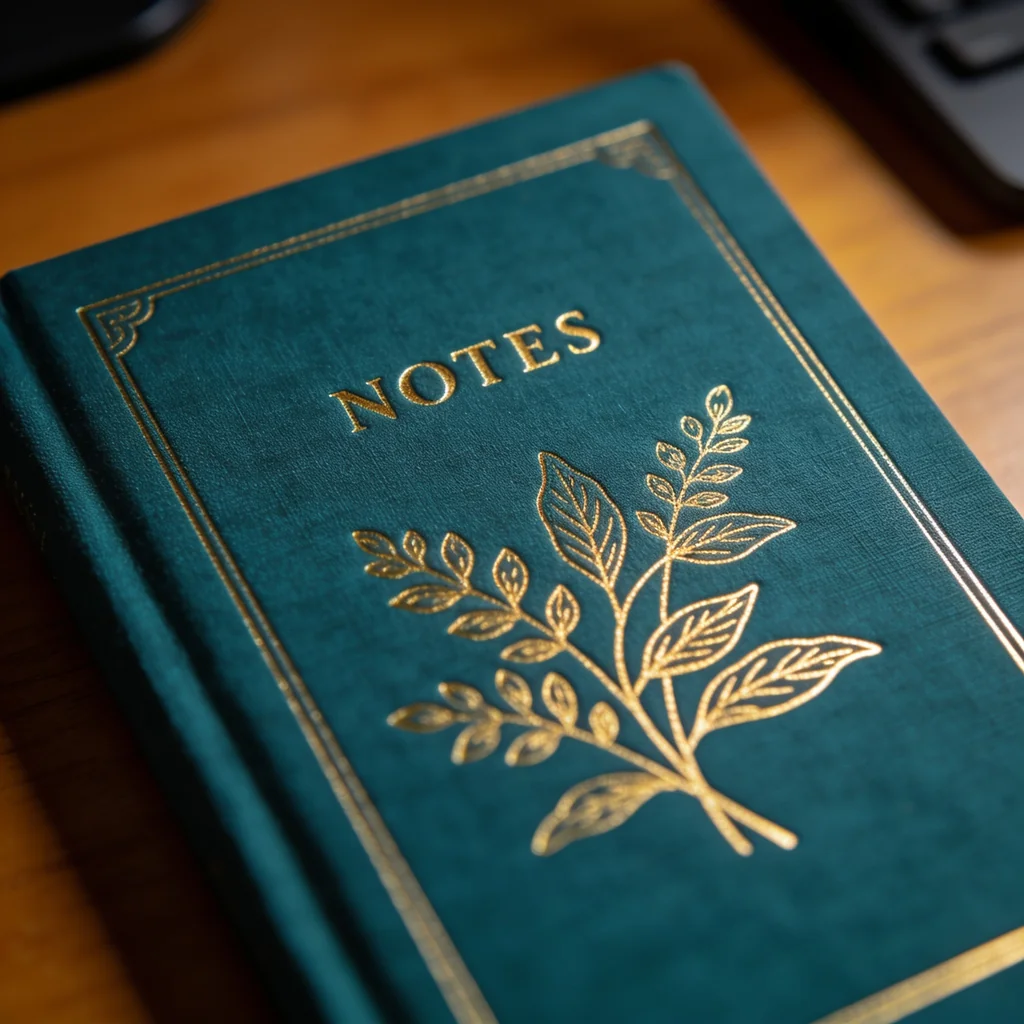
It can. I ran one brief, a deep teal linen journal with gold foil botanical art, a foil-stamped word, and a debossed border, through four of the strongest image models with the same prompt: Nano Banana 2, GPT Image 2, Seedream 4.5, and FLUX.2 Pro. The foil and the deboss came out beautifully, one model rendered foil that genuinely looks metallic, and the only weak spot was the one you would predict from the rest of this series: the text. This is the stationery entry in our product-photography series, alongside the skincare, jewelry, supplements, makeup, food and beverage, footwear, candles, clothing, furniture, electronics, handbags, sunglasses, glassware, flowers, watches, perfume, packaging, pet products, toys, textiles, cookware, drinkware, soap, ceramics, art prints, earbuds, houseplants, knives, and automotive wheels tests and the broader best AI image model for product photography roundup.
Quick answer
- Best overall, and cheapest photoreal: Seedream 4.5. Foil that reads as reflective metal, the most detailed linen, a premium macro.
- Best deboss: Nano Banana 2. A pressed-in border with real depth and shadow.
- The catch: foil text. A short word came out clean on three of four (FLUX softened it), but a longer foil title would face the usual AI-text weakness.
If you only remember one thing: the finishes that sell stationery, foil and deboss, are rendered beautifully, so choose on foil realism, and proof any foil lettering because the text is still the soft spot.
The test, model by model
One brief, four models, same prompt. I judged the foil first, the sheen and the text, then the deboss, then the linen.
Seedream 4.5 rendered the foil the way foil actually behaves. The gold is reflective and light-catching, with bright highlights where it angles into the light, not the flat gold-ink look the others lean toward. The linen weave is the most detailed of the four, and the short foil word came out clean, because a single short word does not trigger the garbling that longer text does, so its usual text weakness never came into play. This is the same metal-and-material strength it shows everywhere in this series, applied to foil. Best result, lowest cost of the photoreal options.
Nano Banana 2 gave the most convincing deboss, the pressed-in border has genuine depth and a soft shadow in the impression, the effect you feel on a real letterpress cover. The foil art and the word are clean and legible, the linen reads right, and a ribbon bookmark finishes it. As a complete, tactile product shot it is excellent, and at a third of GPT's cost.
GPT Image 2 kept the foil lettering the crispest, evenly spaced and correctly formed, the text strength it shows on packaging applied to a foil title. The botanical motif is elegant and the linen is believable. Its foil reads slightly flatter, more gold ink than metallic foil, than Seedream's, but for any stationery where a foil word or date has to be exact, it is the model to reach for.
FLUX.2 Pro produced the most dramatic lighting, a warm raking light that makes the foil glint across the cover, and a believable linen. Its weak point is the predictable one: the foil lettering is the softest of the four, with slightly malformed letterforms, the same incidental-text wobble FLUX shows elsewhere. For a finishes-and-mood shot at the lowest cost it is strong; for legible foil copy, it is not the one.
The comparison
| Model | Foil sheen | Foil text | Deboss | Rough cost/image |
|---|---|---|---|---|
| Seedream 4.5 | Best, reflective metal | Clean (short word) | Present | ~4.8 credits |
| Nano Banana 2 | Good | Clean | Best, real depth | ~9.3 credits |
| GPT Image 2 | Flatter, gold-ink look | Cleanest | Subtle | ~26.4 credits |
| FLUX.2 Pro | Good in raking light | Softest | Subtle | ~3.6 credits |
Credit costs are first-hand from this test on Masonry; per-image rates move, so check current pricing.
Why stationery finishes came out better than the text
Stationery is a finishes product, and the finishes are exactly what this generation of models is good at, with one familiar exception.
Foil is metal, and metal is solved. Gold foil is a reflective metallic surface, the same thing these models render so well on jewelry and cookware. Seedream rendered it as genuinely reflective, catching light like real foil rather than printing flat gold. The deboss, a subtle surface relief, also read well, Nano best, because it is a lighting effect and lighting is a strength. The premium finishes are not the problem.
The foil text is, eventually. A single short word came out clean on three of four, which is the good news, but it is also the limit. The moment a cover carries a longer foil title, a date, a quote, or fine copy, it becomes the dense-text case this series keeps flagging, where the letters garble. GPT Image 2 is the safest for foil lettering, and for anything truly exact, composite the real title over the generated finish.
The design is still generic. Each model invented its own motif and layout. For your actual journal or card line, the cover design is the product, so generate from a reference of the real artwork rather than a prompt.
How to shoot your stationery line without a studio
The workflow is the roundup approach, applied to a finishes-forward product. Trust the foil and deboss, and choose on foil realism, Seedream for the most metallic, Nano for the most tactile deboss. Proof any foil lettering at full zoom, and for a longer title or exact copy, reach for GPT Image 2 or composite the real text. And for your exact cover, feed a reference image so the artwork and layout are yours.
With the Masonry CLI you can compare the foil realism across models, or pass your real cover as a reference to keep the exact design:
masonry image "teal linen journal with gold foil botanical art, debossed border, warm desk, soft light, photoreal" --model seedream-4-5 masonry image "place this exact journal cover on a sunlit desk, keep the foil and deboss" --ref ./real-cover.png --model gpt-image-2
The bottom line
Stationery is a finishes story, and the finishes win. Gold foil and a pressed deboss, the subtle physical effects that sell premium paper, came out convincingly on all four models, with Seedream 4.5 rendering foil that actually looks metallic at the lowest cost and Nano Banana 2 the most tactile deboss. The one soft spot is the familiar one: foil text holds for a short word but garbles as it gets longer, so reach for GPT Image 2 or composite real lettering when copy has to be exact. See how the same fidelity-first logic plays out across every product type in our best AI image model for product photography roundup, or run your own stationery from one place with the Masonry CLI.

