A luxury watch is a hard product for a reason most categories are not: it compresses several difficult things into a few square centimeters. Polished steel that mirrors the room, a curved sapphire crystal, brushed surfaces, and then the dial, a dense field of applied indices, multiple hands, sub-dials, fine printing, and a date window, all of which have to be precise. The case is craftsmanship; the dial is information, and information is what image models get wrong.
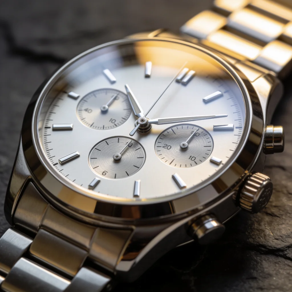
So I tested it. I ran one brief, a luxury chronograph with a silver dial, three sub-dials, applied indices, and a steel bracelet, no logos, through four of the strongest image models with the same prompt: Nano Banana 2, GPT Image 2, Seedream 4.5, and FLUX.2 Pro. The cases came out gorgeous on all four. The dial is where they split, and one model quietly cloned a famous design. This is the watch entry in our product-photography series, alongside the skincare, jewelry, supplements, makeup, food and beverage, footwear, candles, clothing, furniture, electronics, handbags, sunglasses, glassware, flowers, perfume, packaging, pet products, toys, textiles, cookware, stationery, drinkware, soap, ceramics, art prints, earbuds, houseplants, knives, and automotive wheels tests and the broader best AI image model for product photography roundup.
Quick answer
- Best dial, most legible: GPT Image 2. Readable sub-dial numerals, even indices, a coherent symmetric dial. The text strength that wins on packaging wins here too.
- Best case and material, cheapest photoreal: Seedream 4.5. A stunning polished-steel macro, but the sub-dial numerals garble up close.
- The trap: Nano Banana 2 produced a clean dial but a design closely resembling a TAG Heuer Carrera, despite a no-logos prompt. The shape is the brand.
If you only remember one thing: the case is solved, the dial is not. Use the model with the best dial for accuracy, or composite your real dial onto the best case, and watch for an accidental brand clone.
The test, model by model
One brief, four models, same prompt. I judged the dial first, hands, indices, sub-dials, fine text, then the metal and the design.
Seedream 4.5 made the most beautiful watch, exactly as it has across this series. The polished steel mirrors believably, the sunburst dial catches the light, the crystal and crown are detailed, it looks like a paid macro shot. But the dial is where its usual weakness shows: the sub-dial numerals do not form a coherent chronograph scale, they are plausible-looking near-numbers, the same garble it produced on small labels in skincare and supplements. For a hero where the dial reads as texture, it is stunning. For one where a customer reads the sub-dials, it is not.
GPT Image 2 won the part that actually matters. Its dial is legible and coherent: the sub-dial numerals read as real scales, the indices are even, the hands are clean, and the whole layout is symmetric and balanced. This is the same strength it shows on packaging text and the sunglasses front-on symmetry, applied to the densest dial in the test. It also produced a generic design rather than copying a famous one. It is the priciest model, and on a watch dial that price buys the thing you most need.
Nano Banana 2 rendered a believable, coherent chronograph: the three sub-dials hold, the indices are even, the tachymeter bezel and date window read right. The problem is the one electronics surfaced with the Apple Watch: it reached for a famous design. The result closely resembles a TAG Heuer Carrera, the case, bezel, and dial layout a brand owns, generated from a prompt that asked for none of it. A clean dial on a borrowed silhouette is a trademark risk, not a styling choice.
FLUX.2 Pro gave a clean watch at the lowest cost, with believable steel and even indices, but its sub-dials are the softest of the four, present but smeared rather than legible. This is the usual FLUX tradeoff, a strong overall image with the finest detail dialed back. For a thumbnail or a shot where the sub-dials are not scrutinized it is fine, and the price is the lowest, but it is not the one for a dial-forward hero.
The comparison
| Model | Dial legibility | Metal / case | Cloned a brand? | Rough cost/image |
|---|---|---|---|---|
| GPT Image 2 | Best, readable sub-dials | Strong | No, generic design | ~26.4 credits |
| Seedream 4.5 | Garbled sub-dial numerals | Best, premium macro | No, generic design | ~4.8 credits |
| Nano Banana 2 | Coherent, legible | Strong | Yes, TAG-Carrera-like | ~9.3 credits |
| FLUX.2 Pro | Soft, smeared sub-dials | Good | No, generic design | ~3.6 credits |
Credit costs are first-hand from this test on Masonry; per-image rates move, so check current pricing.
Why the dial is a watch's label
The watch result splits the same way the supplement and clothing results did, because the dial is the same kind of problem: dense, precise, meaningful detail at small scale.
The case is solved, the dial is not. Polished metal and a crystal are surfaces, and modern models render surfaces beautifully. A dial is information, sub-dial scales, fine printing, exact index spacing, and that is high-frequency detail the model approximates rather than reproduces. GPT Image 2, the strongest text model, kept it legible; Seedream and FLUX softened or garbled it. If the dial has to be accurate, the model choice is the dial, not the metal, or you composite a real dial onto a generated case.
The design is the trademark. As with the smartwatch and the sneaker, a no-logos prompt does not stop a model from reaching for a famous silhouette. Nano's TAG-Carrera resemblance is the reminder that for watches the case shape, bezel, and dial layout are protected design, not just the logo. Generate from a reference of your real watch to avoid an accidental clone.
How to shoot your watch line without a studio
The workflow is the roundup approach, tuned for a product whose hard part is tiny and precise. Use AI for the case, bracelet, metal, and lighting, run it through two models, and judge the dial at full zoom rather than in the grid, because the sub-dials and fine text are where it breaks. For accuracy, composite your real dial onto the generated case. And for the design itself, feed a reference photo of the actual watch so the silhouette is yours rather than a borrowed one.
With the Masonry CLI you can compare the dials side by side, or pass your real watch as a reference to keep the exact design and dial:
masonry image "luxury steel chronograph, silver dial, sub-dials, macro on slate, soft studio light, photoreal" --model gpt-image-2 masonry image "place this exact watch on a dark slate surface with soft reflections, keep the dial" --ref ./real-watch.png --model seedream-4-5
The bottom line
Watches are a case-versus-dial story. Every model nails the polished steel, so the choice is the dial: GPT Image 2 for the most legible, accurate dial, Seedream 4.5 for the most beautiful case at the lowest cost if you will composite the real dial, and a careful eye for the brand-clone that Nano slipped into. Judge the dial at full zoom, protect it with a real composite when accuracy matters, and use a reference photo so the design is your watch. See how the same fidelity-first logic plays out across every product type in our best AI image model for product photography roundup, or run your own watches from one place with the Masonry CLI.

